Qi ERP System
UX/UI Case Study
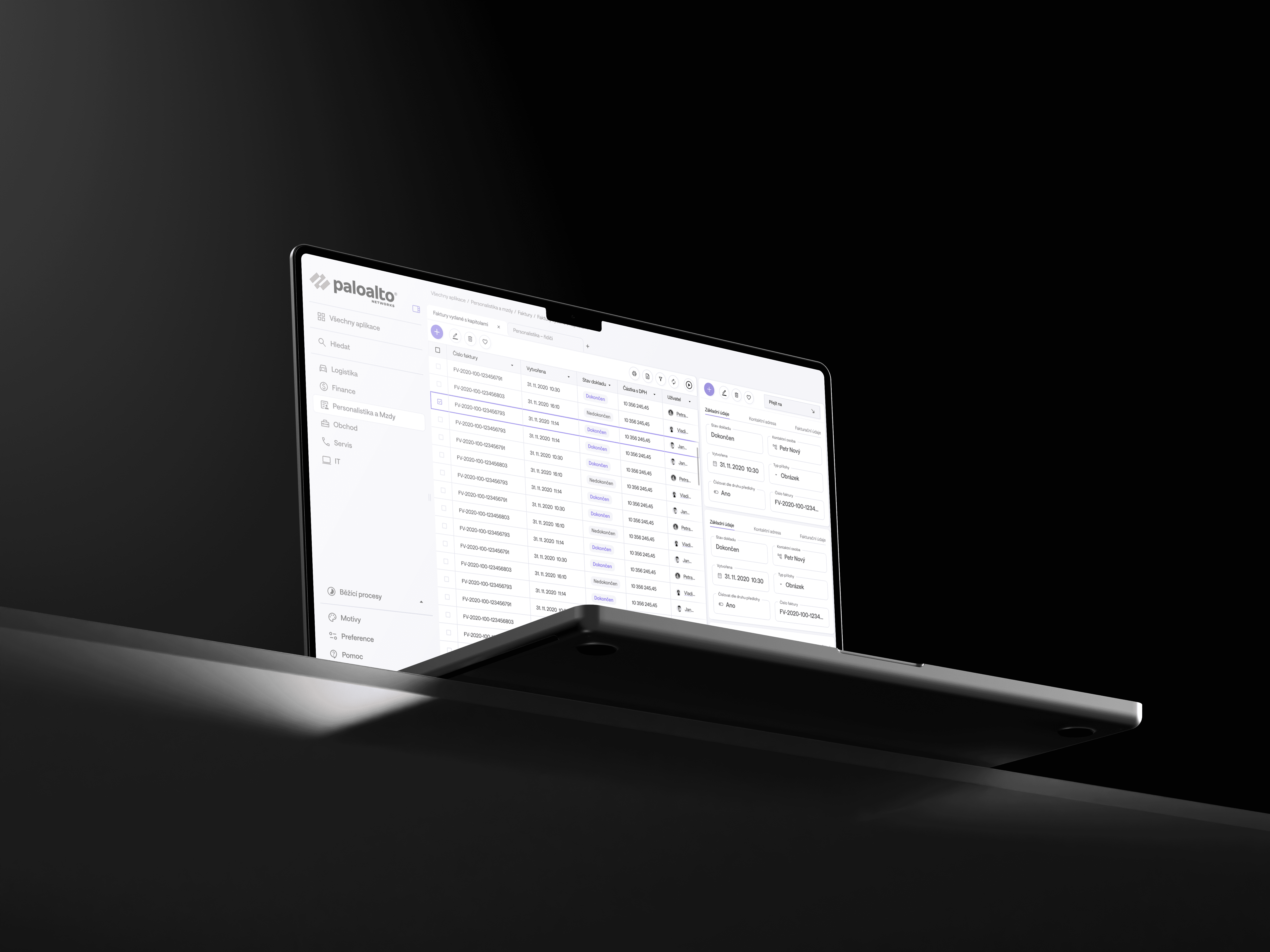
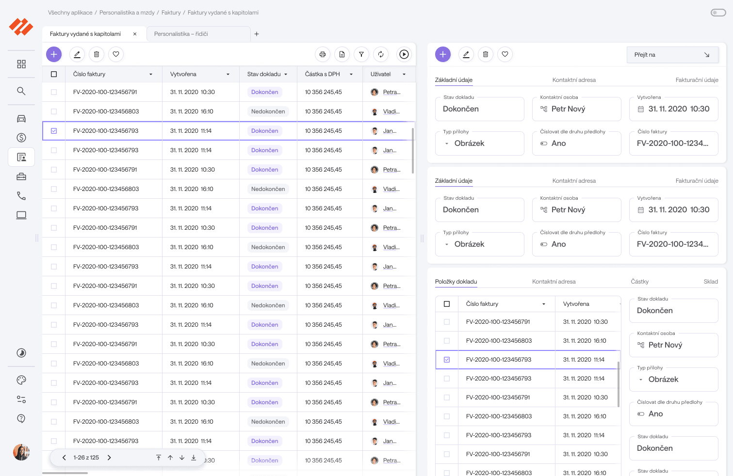
For the QiGroup client, I designed a new user interface for their new complex ERP system.
What started as a visual reskin evolved into a complete ergonomic redesign based on more defined UX principles. The result is an airy, well-organized interface in muted grey tones with purple accents, also available in Dark Mode.

The Goal
Initially this project was supposed to be a simple re-skin of an existing Qi ERP system layout. This system, the Qi 2.0, was developed as a successor to a widely used Qi 1.0 that was severy outdated. After analyzing and testing the new version, many problems came to light, so this project became a complete UX/UI layout overhaul.


Initial state before redesign
Analysis
I started the project by analyzing the Qi System layout. It had so many problems that I could not possibly fit them into this paragraph, but to list some:
No working "Go backwards" – no back arrow or swiping
Clicking on the main logo expanded the sidebar, instead of navigating to dashboard
No hierarchy in the tool bar, no distinction between different functionalities ("Edit" and "Translate" or "Hide" had the same level of importance)
Search completely hidden (super important in an ERP!)
No navigation clues – no breadcrumb, highlighting
Menu above the tool bar is linked to a container on a completely different spot on the screen
No distinction between editable/non-editable cells
I also had the chance to speak to people who had been using Qi 1.0 or tested Qi 2.0. Everyone confirmed that the ergonomics of both systems were barely usable.
At this point I knew that a simple re-skin would not suffice. The scope had to be adjusted to fit all the new adjustments to the UX, wireframing and user-flows.
Design System
To quicken the process (the scope was adjusted, but the timeline stayed the same), I decided to use an already well-defined design system, Material Design. It significantly reduced the required time for mocking-up a modern and functioning layout.
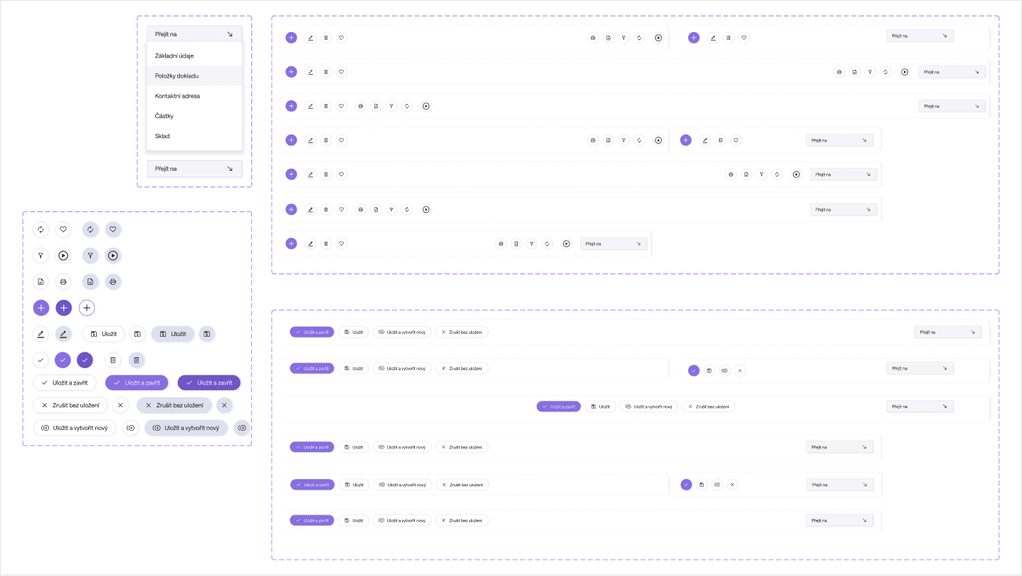
I also based this project on the principle of Atomic design, so I started with simple buttons and text cells and gradually scaled up to full tool bars and tables. Layout system is based on a 8pt grid.

Material Design (Google), Atomic Design (Brad Frost), 8 pt Grid System

Color Scheme
Color Scheme
The color palette I chose consists mostly of B&W, inbetween shades and a lilac purple as an accent. The chosen colors had to be as calm as possible, as prolonged viewing could be irritating to a user if too-saturated or bright colors were used. Purple is known for having a calming effect, while stimulating enough for the brain to increase productivity. The theme is also available in dark mode.
Typography
For typography I chose a simple, "invisible" sans-serif font Saans. I use only two weights – Regular and Medium. That is perfectly sufficient for readability and hierarchy definition while not making the text too busy.


Typography
My redesigned version of Qi ERP System is light, airy and modern. The layout has been improved to function more ergonomically and intuitively. A user-friendly approach helps the users work more efficiently, as they do not get stuck on wrong UX decisions. The visual style eases eye fatigue and communicates
I am satisfied with the changes that I made. I have tested the final product on a smaller scale of users and all showed improvement in usability, speed and overall fatigue.